Upgrading the Apple Store app.
Role
UX/UI Designer
Industry
Tech
Duration
3 months
Key Highlights
Discovery: Conducting discovery sessions with stakeholders.
App Audit & Analysis: An audit of the app was performed to determine the areas for most improvement.
Insights & Key Takeaways: The big problems surfaced in the app audit were distilled into actionable tasks.
Design & Validate: Developed design concepts and validated design with user tests for feedback and design refinements.
Design System: The app was aligned and conformed to the latest iOS.
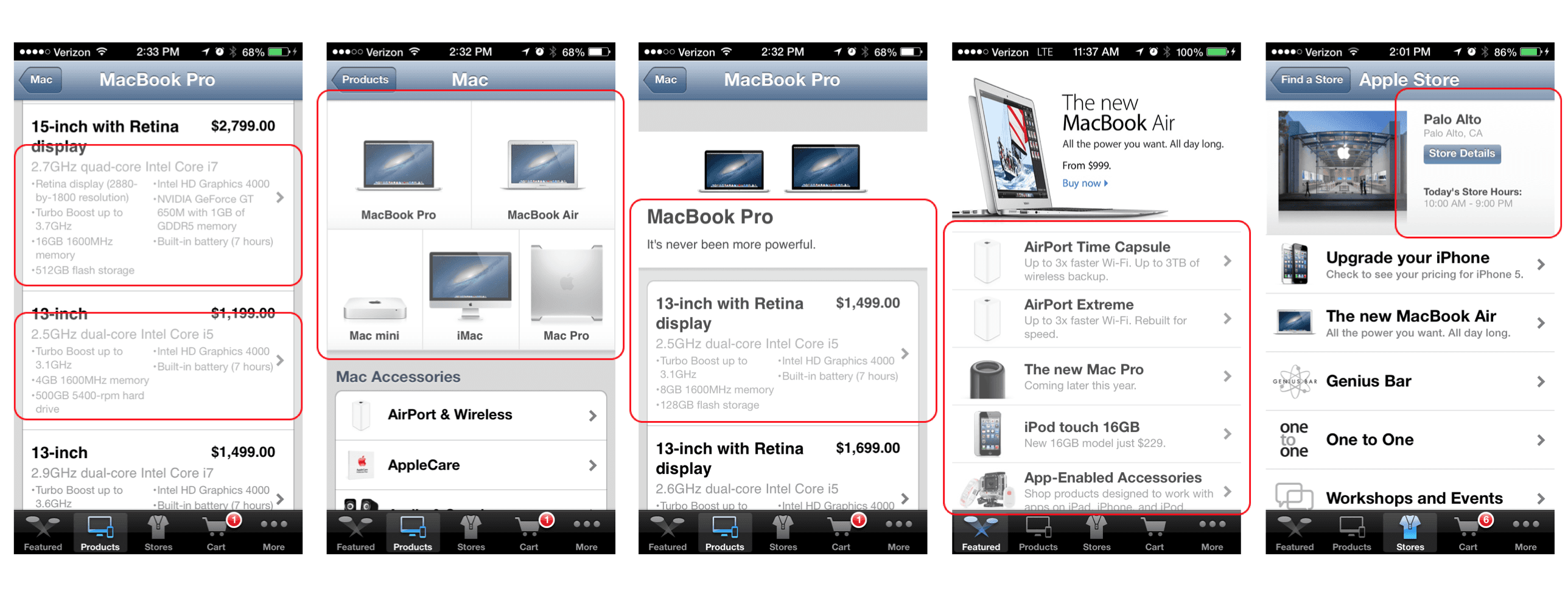
App Review
A comprehensive app audit and analysis was performed to identify the areas for most improvement. The audit was distilled into the following key takeaways:
Simplify
Easy Navigation
Tell stories the Apple way
Migrate to the new iOS
Clarity, Focus & Simplicity
One of the main goals of the new app was to show less but with more focus and clarity of purpose. Everything should be clear, guided, & most of all, be “obvious” to the user.
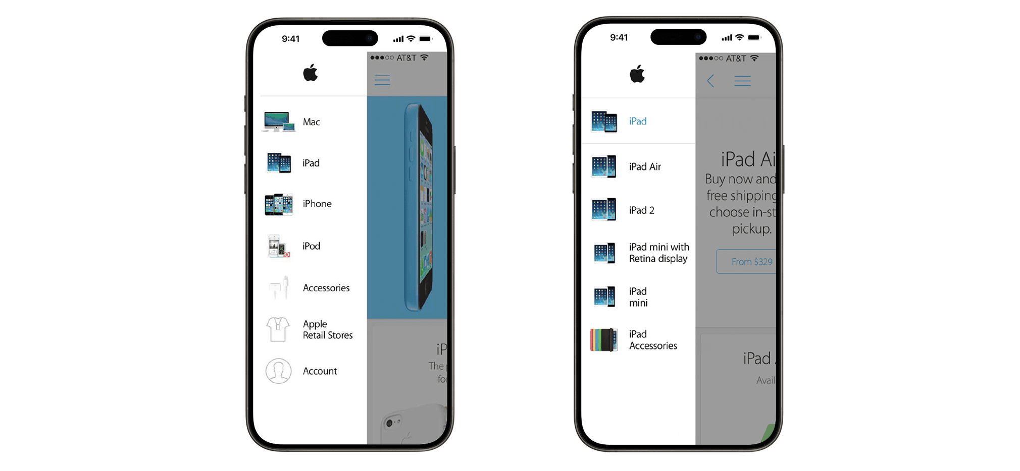
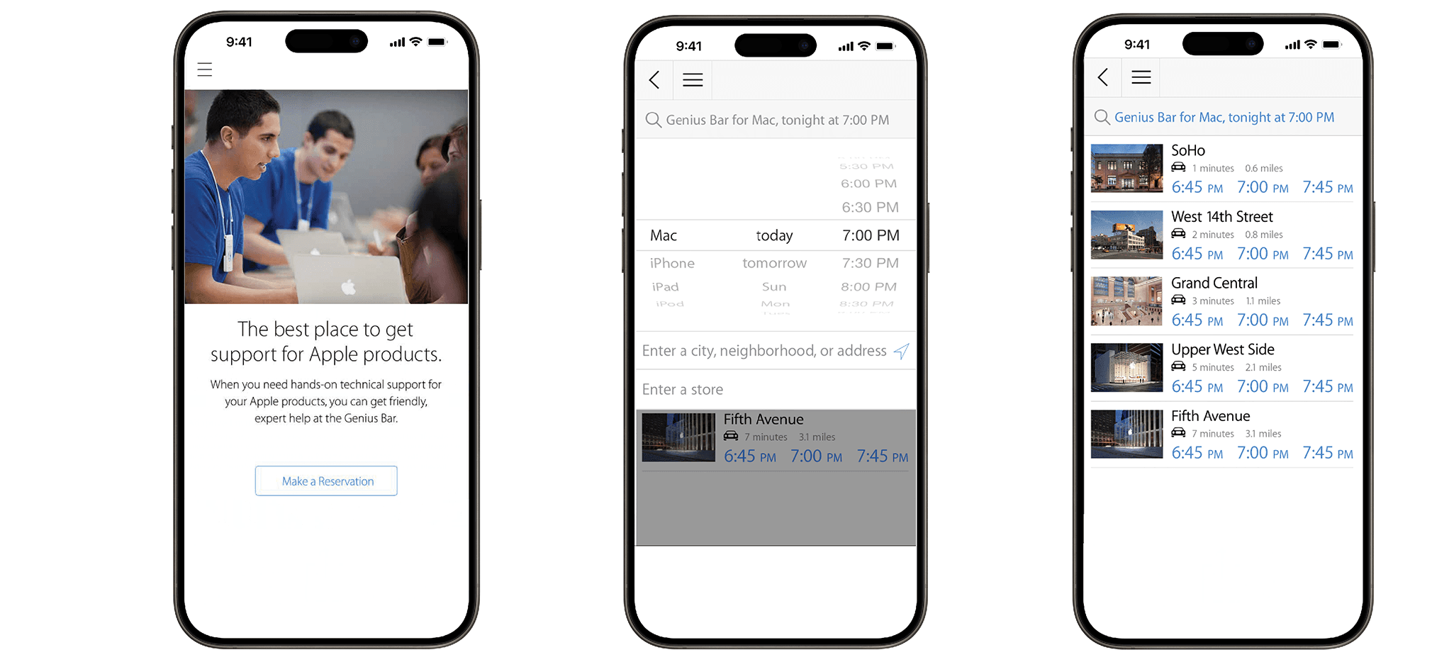
Easy to Find Everything
The navigation should be clear to the user where they can find what they're looking for, and indicate where they can go to find it.
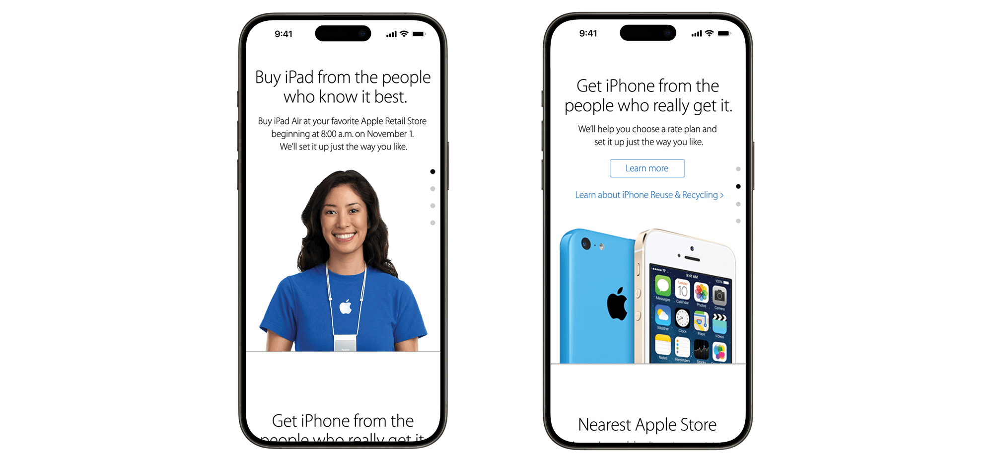
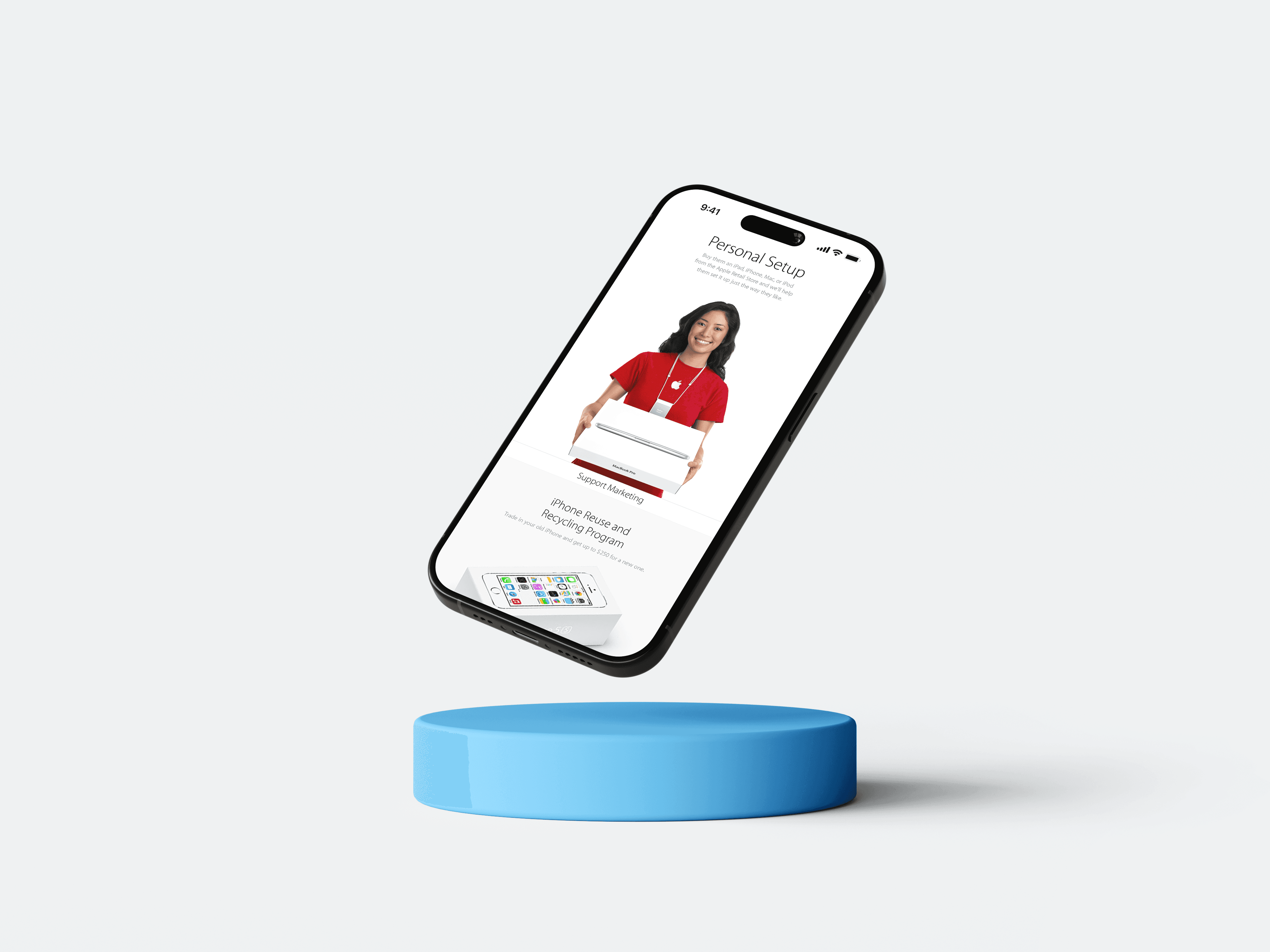
Tell Product Stories the Apple Way
Apple has always been known for their product storytelling with their big, bold titles, high-impact imagery, and punchy copy that Apple has developed so well over the years. Thus, it became a very high priority to restore the glory of Apple’s marketing impact as viewed in their ads, website, and everywhere else.

The Makeover
The introduction of iOS 7 was an opportunity to upgrade the app to a much more minimal, simplistic “look & feel.”